I recently wanted to create a button for a plotly (the Python library) plot that exchanges the underlying data. I got stuck in the middle and since I couldn’t find much on Google, I thought it might be worth sharing this quick one with you.
A plotly plot can be updated by using passing updatemenus to the fig.update_layout() method. In the plotly reference, we find that there are two ways (more precisely types) to update the data, dropdown and buttons. In this post, we go for buttons.
There are four methods to change something in the plot by pressing the button: restyle, relayout, animate, and update. They determine which plotly.js function is called to modify the chart, in other words: what you can change in the plot. We want to modify the data but we might also need to adapt the corresponding axis labels, therefore, it is always sensible to go for update, which allows us to do both. Let’s create a data frame and a quick scatter plot to see how this works in action! Imagine you want to plot the relationship between temperature in degree Celsius and how many ice cream cones or drinks are sold per hour. After all, both should become pretty popular with rising temperatures. Yummy! Here is the data frame:
1
2
3
4
5
import pandas as pd

df = pd.DataFrame(
    dict(temperature=[24, 26, 28], ice_cream_cones=[14, 20, 23], drinks=[18, 22, 28])
)
Next, the scatter plot:
1
2
3
4
5
6
7
8
9
10
11
12
13
14
15
16
17
18
19
20
21
22
23
24
25
26
27
28
import plotly.graph_objects as go

fig = go.Figure()

fig.add_trace(
    go.Scatter(
        x=df.temperature,
        y=df.ice_cream_cones,
        name="Ice Cream",
        marker_color="#2457BD",
    ),
)
fig.add_trace(
    go.Scatter(
        x=df.temperature,
        y=df.drinks,
        name="Drinks",
        marker_color="#F0B729",
    )
)

fig.update_layout(
    template="simple_white",
    xaxis=dict(title_text="Temperature [°C]"),
    yaxis=dict(title_text="Units Sold"),
)

fig
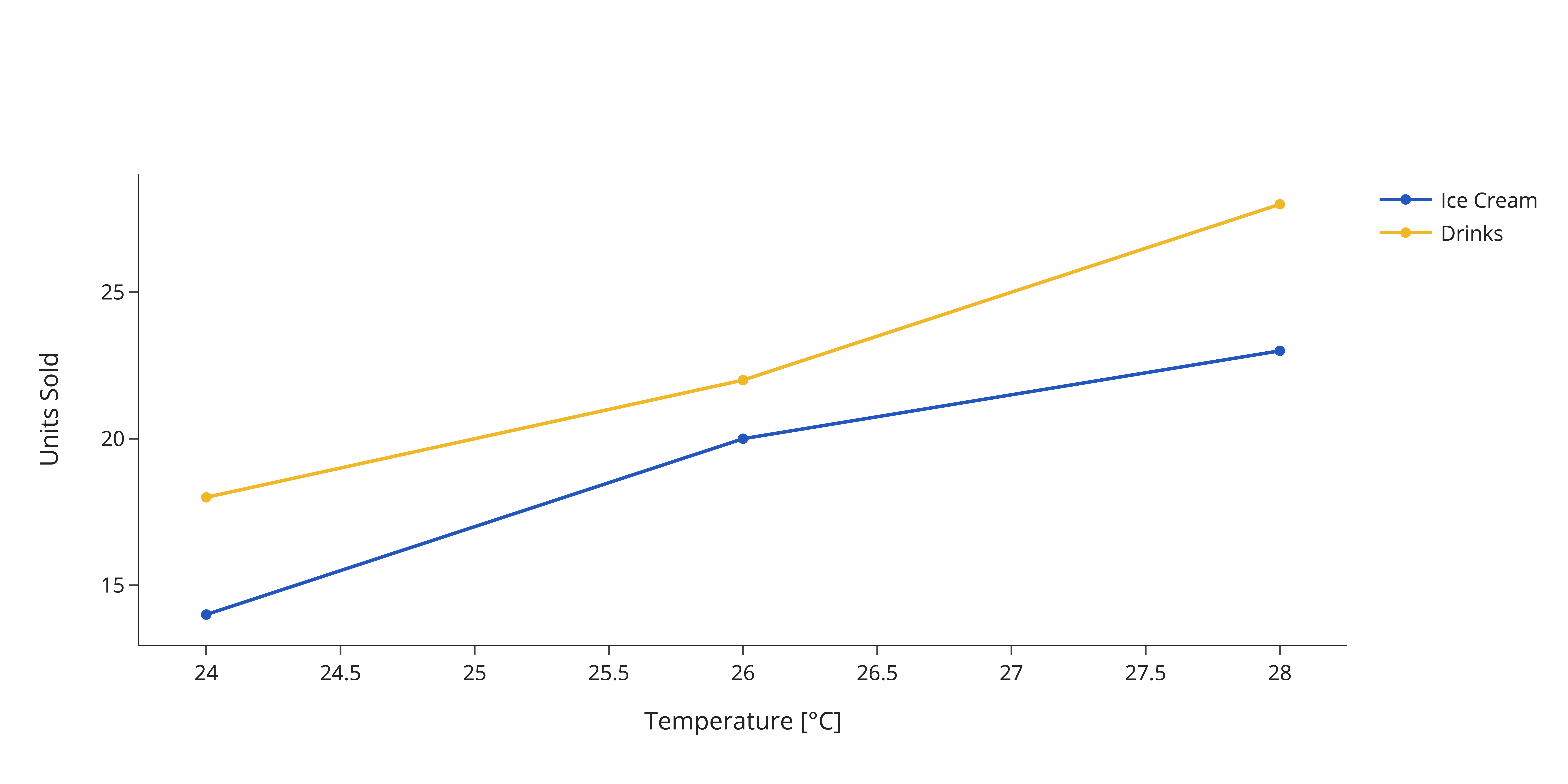
Which results in this plot:

Now, we can give the designated viewer the option to view either the sold ice cream cones or the sold drinks alone instead of viewing both at the same time. In principle, it is possible to modify the underlying figure data in fig.data to do this, but it is way more accessible to implement a button (actually, clicking the legend also works in this simple case). Hence, we provide the option to update the layout by embedding two buttons in the updatemenu. How is this done?
The buttons are passed as a list of dictionaries, each entry is one button. The buttons’ arguments need to be filled with the plot’s attribute you desire to change including its desired value. In general, simply pick an attribute in the plotly reference and assign the desired value. Now a common approach to show a certain trace alone is to hide the remaining traces. The documentation provides us a great example of this. To hide a trace, we modify the attribute visible and assign for each trace whether it should be visible (True) or not (False). Don’t forget to update the y-axis label as well!
1
2
3
4
5
6
7
8
9
10
11
12
13
14
15
16
17
18
19
20
21
22
23
24
25
26
27
28
29
30
31
fig.update_layout(
    updatemenus=[
        dict(
            type="buttons",
            direction="right",
            x=0.7,
            y=1.2,
            showactive=True,
            buttons=list(
                [
                    dict(
                        label="Ice Cream",
                        method="update",
                        args=[
                            {"visible": [True, False]},
                            {"yaxis.title.text": "Cones Sold",},
                        ],
                    ),
                    dict(
                        label="Drinks",
                        method="update",
                        args=[
                            {"visible": [False, True]},
                            {"yaxis.title.text": "Drinks Sold"},
                        ],
                    ),
                ]
            ),
        )
    ]
)
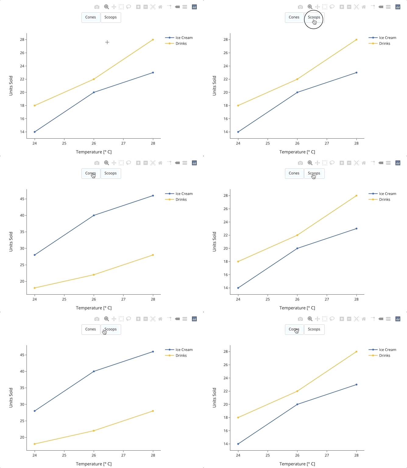
However, I find this suboptimal because all possibly relevant traces need to be drawn and the data in the plot is fixed. We could exchange the data with the button instead and allow us for all the flexibility. Imagine you are rather interested in the actual number of scoops sold. Each ice cream cone holds two scoops of ice cream. You can easily replace the data the same way as above, that is by updating an attribute: y.
1
2
3
4
5
6
7
8
9
10
11
12
13
14
15
16
17
18
19
20
21
22
23
24
25
26
27
df["scoops"] = df["ice_cream_cones"] * 2

fig.update_layout(
    updatemenus=[
        dict(
            type="buttons",
            direction="right",
            x=0.7,
            y=1.2,
            showactive=True,
            buttons=list(
                [
                    dict(
                        label="Cones",
                        method="update",
                        args=[{"y": [df["ice_cream_cones"], df["drinks"]]}],
                    ),
                    dict(
                        label="Scoops",
                        method="update",
                        args=[{"y": [df["scoops"], df["drinks"]]}],
                    ),
                ]
            ),
        )
    ]
)
Et voilà, there it is:

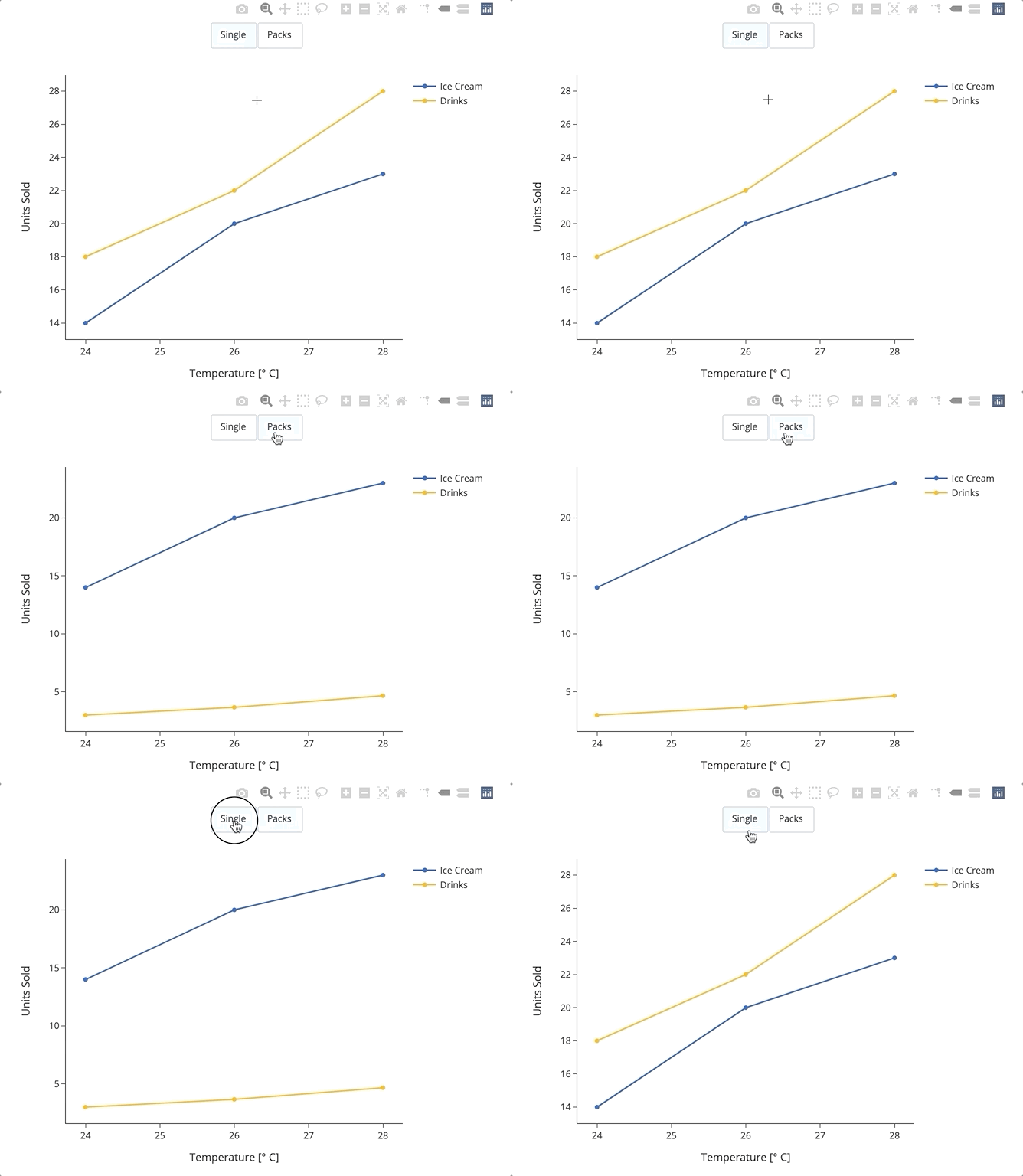
In fact, you can even pass a function to the plot. A simple example: What if you are interested in sold six-packs instead of single drinks? You can implement a function to divide the drinks by 6:
1
2
3
4
5
6
7
8
9
10
11
12
13
14
15
16
17
18
19
20
21
22
23
24
25
26
27
28
29
30
31
32
33
34
35
def convert_to_sixpack(x):
    return x / 6


fig.update_layout(
    updatemenus=[
        dict(
            type="buttons",
            direction="right",
            x=0.7,
            y=1.2,
            showactive=True,
            buttons=list(
                [
                    dict(
                        label="Single",
                        method="update",
                        args=[{"y": [df["ice_cream_cones"], df["drinks"]]},],
                    ),
                    dict(
                        label="Packs",
                        method="update",
                        args=[
                            {"y": [
                                    df["ice_cream_cones"],
                                    convert_to_sixpack(df["drinks"]),
                                ]
                            },
                        ],
                    ),
                ]
            ),
        )
    ]
)
And here we are!

