plotly makes it easy to create an interactive stacked or grouped bar chart in Python by assigning the desired type to the layout attribute barmode. Unfortunately, barmode only takes either stack or group but not both as an argument. It seems like they are currently working on this option, but there is a workaround for now: subcategory axes!
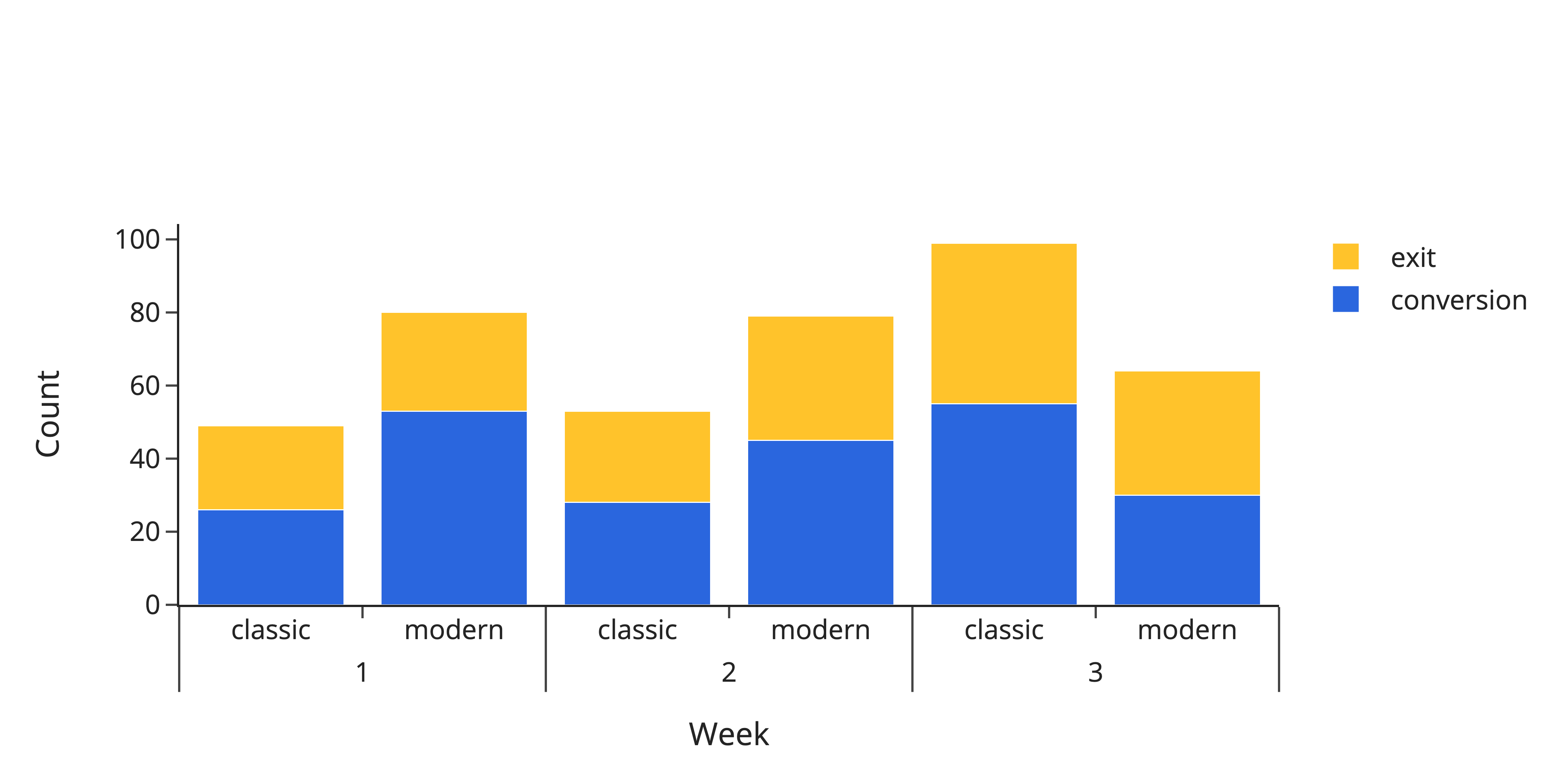
Let’s say you compare two design layouts of your online store — modern and classic — in a small A/B test. You collect data for three consecutive weeks and count the number of conversions and exits per layout and week. Let’s convert this information into a data frame:
1
2
3
4
5
6
7
8
9
10
import pandas as pd

df = pd.DataFrame(
    dict(
        week=[1, 1, 2, 2, 3, 3] * 2,
        layout=["classic", "classic", "modern", "modern"] * 3,
        response=["conversion", "exit"] * 6,
        cnt=[26, 23, 45, 34, 55, 44, 53, 27, 28, 25, 30, 34],
    )
)
To plot this, we need a categorical x-axis that shows the week, stacked bars to show the number of conversions and exits, and those bars grouped into modern and classic. Since barmode cannot be stack and group at the same time, the grouping must be done by sub-categories. Simply pass a list in form of [category, sub-category] to x,l eave barmode at "stack" and add a trace per response category (here: conversion and exit).
1
2
3
4
5
6
7
8
9
10
11
12
13
14
15
16
17
18
19
20
import plotly.graph_objects as go

fig = go.Figure()

fig.update_layout(
    template="simple_white",
    xaxis=dict(title_text="Week"),
    yaxis=dict(title_text="Count"),
    barmode="stack",
)

colors = ["#2A66DE", "#FFC32B"]

for r, c in zip(df.response.unique(), colors):
    plot_df = df[df.response == r]
    fig.add_trace(
        go.Bar(x=[plot_df.week, plot_df.layout], y=plot_df.cnt, name=r, marker_color=c),
    )

fig
And here it is: